Type is everywhere. In order for myself to gain a firm understanding as to the complexities of designing typefaces, I have begun to explore the typefaces that I see on a daily basis.

Most typefaces for larger companies are created specifically of them, or for their logotype. Most mainstream brands make heavy use of sans-serif fonts, most commonly derivatives of Helvetica, Futura/TW Cent MT, and Gill Sans. In order to distinguish themselves, alterations are made to these typefaces – an example of this would be Apple Garamond, being significantly more narrow and a taller x height than the standard Garamond typeface.
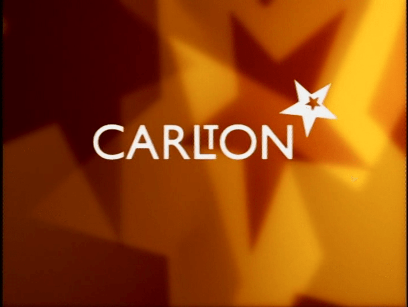
Another important thing to note is the use of kerning and arrangement. Broadcaster Carlton used Gill Sans in an inventive way, in a logo designed by Martin Lambie Nairn. By using the standard Gill Sans font, and shifting the T, the logo became much more distinctive and recognisable, than simply typing the font . Lambie-Nairn’s approach of using something recognisable and yet distinguished is something I wish to incorporate in my own typeface.
Leave a comment