A large part of the branding for a venture capital firm has to do with trust. Establishing trust with a client is vital for a company that will be investing millions on behalf of them. Enganche Venture Capital are a mysterious investment group which want more exposure in order to grow, yet want to retain a refined, premium company. Enganche can roughly translate as ‘connection’ in derivatives of Spanish. As Enganche wish to reach out to new potential customers and make further ‘connections’, this association with the core branding could prove useful, and could be used in a number of innovative ways.
Enganche is described as an investment company that is ‘a riskier bank for the already wealthy’. With risk comes an element of excitement. With the company being described as ‘mysterious’, you could expect the company to solely aim to cater for ‘old money’, however with the company wanting to expand into new areas and begin to sponsor art and architecture prizes, Enganche clearly want to appear more accessible, meaning that I should not rule out a modern design from the get go. The brand needs to convey a sense of history, yet retain a modern premium feel.
I have looked into a number of Venture Capitalists and looked at what they do, how they position themselves, and how they are branded.
Balderton Capital
![]()

Balderton Capital uses a modern Serif font and a minimal colour palette, using Black, White and an Orange accent colour. Through looking at Balderton, I have noted the importance of having a logo that can be adapted for social media, especially with the standard square profile picture. Baldertons website makes heavy use of this accent colour in rollovers and interactive elements, but doesn’t overuse it.
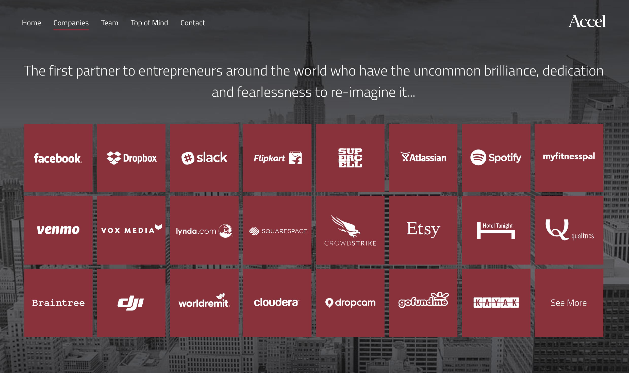
I also came across ‘Accel’ an international venture capitalist firm who appear to operate in a mysterious way, and is branded accordingly. Their website boasts that the company has “uncommon brilliance, dedication and fearlessness.” Accel is responsible for the funding of some big companies, and successful startups, such as Facebook, Spotify and Etsy. Based in Palo Alto, the company clearly has links with some of the major tech companies based there, and the company invests in electronics companies heavily. The organisation is clearly aimed at the male customer. You can count the number of women who work there on one hand. The crimson red and dark grey (or light black!) works well with the logotype, of which there is a single version used across all applications. Because they use the logotype without an icon or logo, it gives the brand a classy, mature feel.
Leave a comment