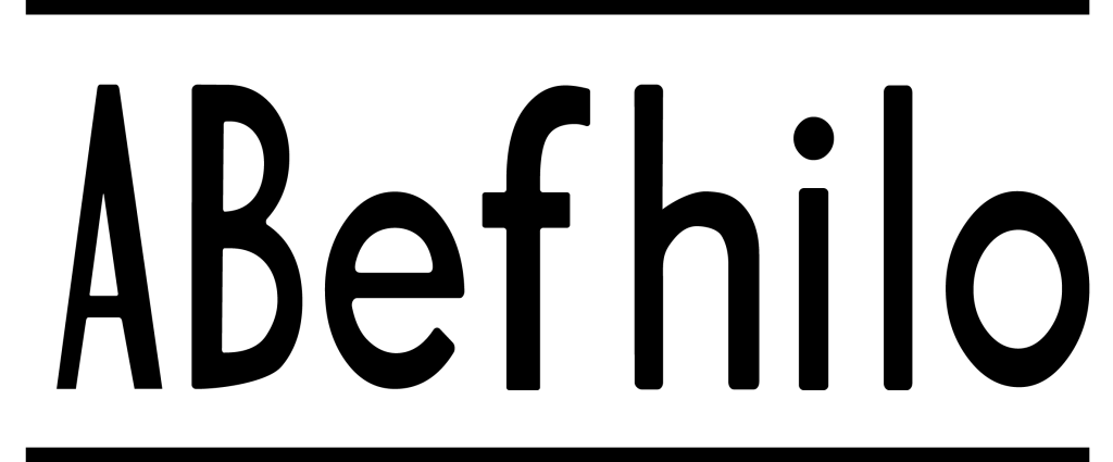
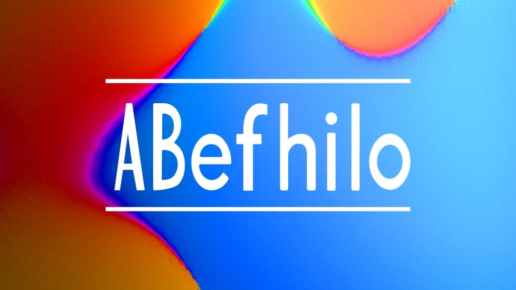
I initially created a rounded version of my typeface, as I had found that a rounded typeface would be more informal. I developed the basic style of my font initially using this rounded effect. My characters are thin and narrow, with emphasis on heavy stroke widths and also emphasis on the space in the middle of letters. I printed this out and refined it with tape and pencil to see if the shape should be altered, but I did not make any further changes. 


Leave a comment