As stated before, I wanted a very simplistic style. However, that does not mean that it cannot have a certain ‘style’. Notable authors with very stylised books include Jon Klassen’s Hat series. I wanted the drawings to have an organic energetic quality, to ensure that they had that ‘hand drawn’ feel, and also to help make it more stylised. The drawings were designed to be basic, with some environment details (such as waves in the sea, and the occasional blade of grass).
 (First sample).
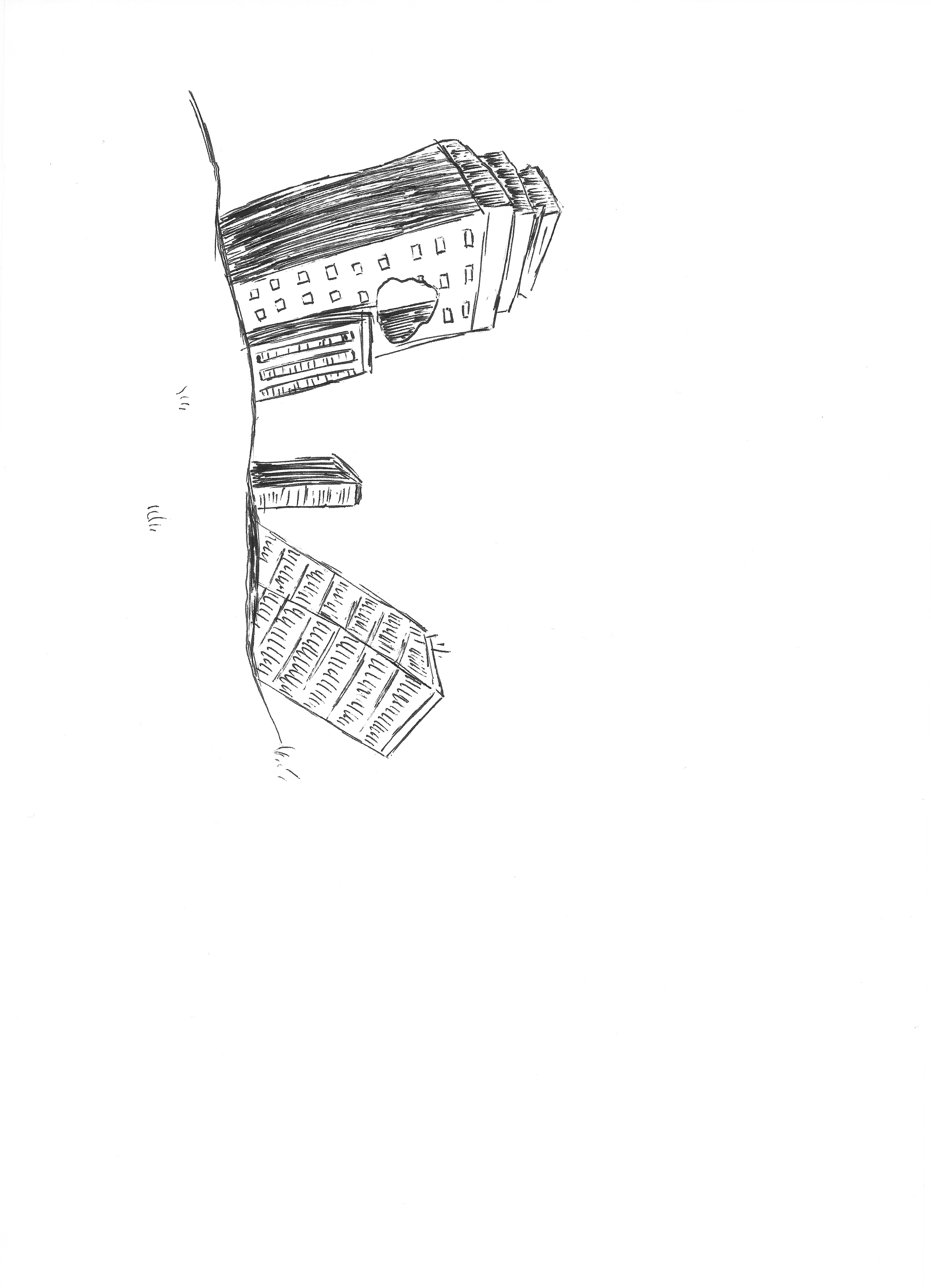
At this point, I completed the majority of drawings for the book, although I still wasn’t set on the style of the book. Almost every asset was drawn and scanned individually, to allow for movement of characters and assets throughout scenes. Each page was scanned at high resolution, allowing for the assets to be reused on different pages at different sizes. Below are a number of characters, backgrounds, objects and textures used within the story.


I did like this style, but I felt that colour would help with the storyline. Colour can make things more dramatic, and bring emotion to the picture. It can also help to keep young children’s attention!
Leave a comment