My research showed that colour has a big effect on the story. it can create the tone within a scene. After my initial attempt using recycled paper and line drawings, I started to play with colour – initially muted tones to go over this paper. However this did not have the effect that I wanted to achieve.
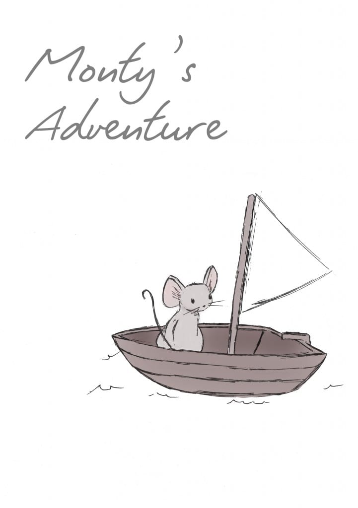
I did consider just colouring in Monty and his immediate surroundings, leaving the background white with inky details (such as the waves in the image below). Though I did like this approach and felt it gave sole focus to the character, it did make it much harder to show his journey within the narrative, and to demonstrate to younger children what life is like for people stuck in war zones. If the storyline was different, this approach might well have worked. (The separate assets mean that a series could be created relatively easily!)
I started to play around with Photoshop’s paint tools, based on work done within the workshops. Instead of overly complex shading and lighting effects, I still wanted to retain that very simple stylised look, with a simple colour palette. In some cases, I used some shading to give the background more depth. using colour in this way meant that it would be easier for younger children to understand the situation of the character
I started with the ‘hero’ shot as a way of showing how the character would look against simple backgrounds- almost a gaussian The flow setting in the Photoshop paint tool allowed me to create some depth with the sea, and with the sky, and the small sketchy lines and details maintain the simple ‘cartoony’ style.

The character style was developed further at this point. Previously, ‘Monty’ could have looked like any mouse. From this revision, he took on larger ears and eyes, and the eyes were later used across all faces on monty. The larger eyes and ears gave him a ‘cute’ look that would appeal more to younger children.
The colour and tone reflecting the mood of the scene (in the above shot, Monty is clearly happy, with the golden sky and light bright blue sea) worked well as I continued to develop the scenes for each page. At this point, I also began to play around with different page layouts, depending on the action within that page. I felt this gave variety to the book, and in some scenes where not much happened visually, the text would become the focus and the child could imagine the situation themselves.

Leave a comment