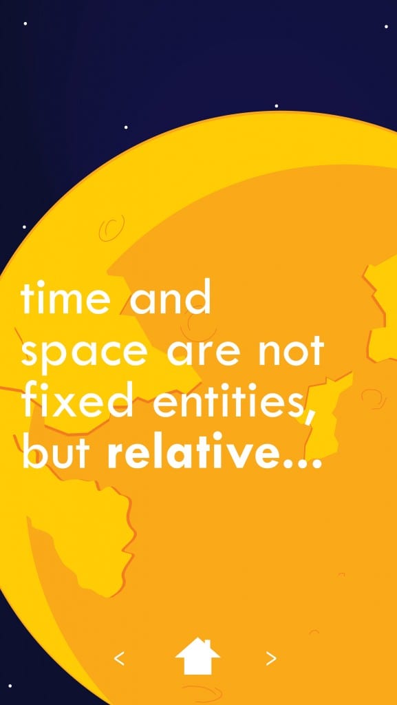
Here are my final designs for my Infographic ‘App’ Relative. I am very pleased with the way this has turned out, and the way I have been able to refine the design to make it both look better and be more functional. The app was where I started the design process, and the poster and desktop version were based on the styling of the App. I also pleased with the colour schemes and fonts used within the app, as I feel they are the right balance between style and legibility. 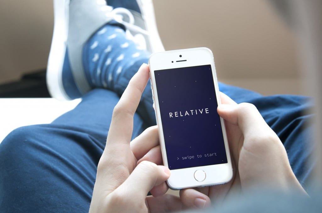
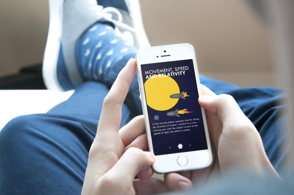
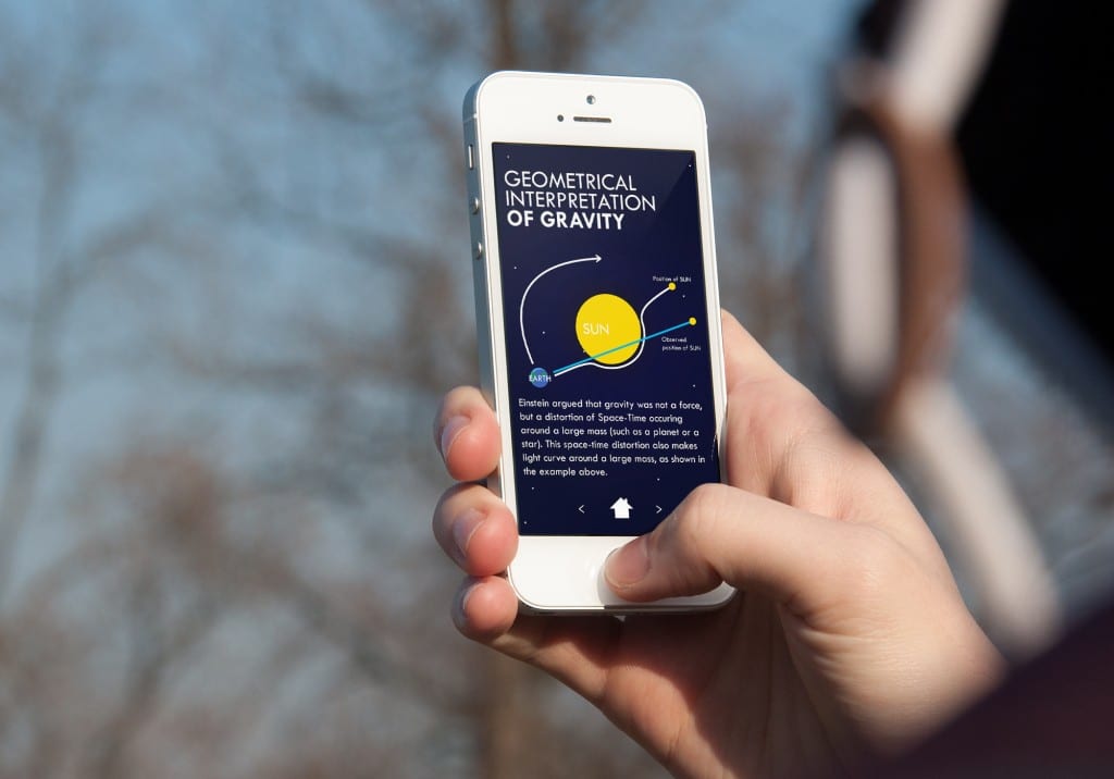
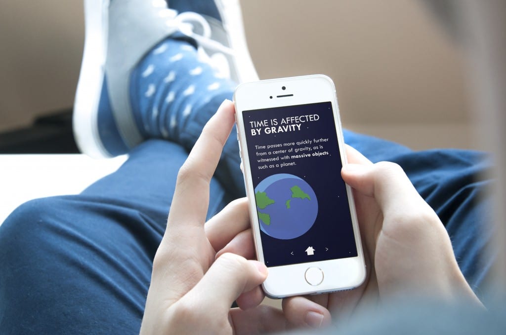
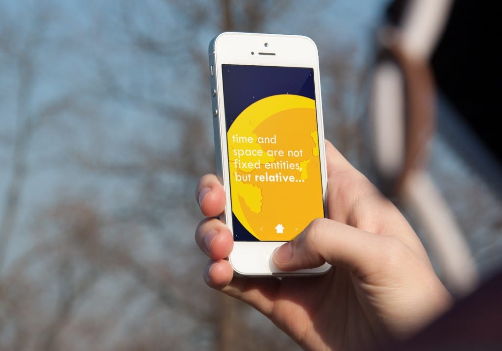
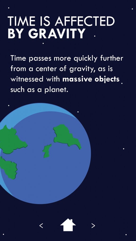
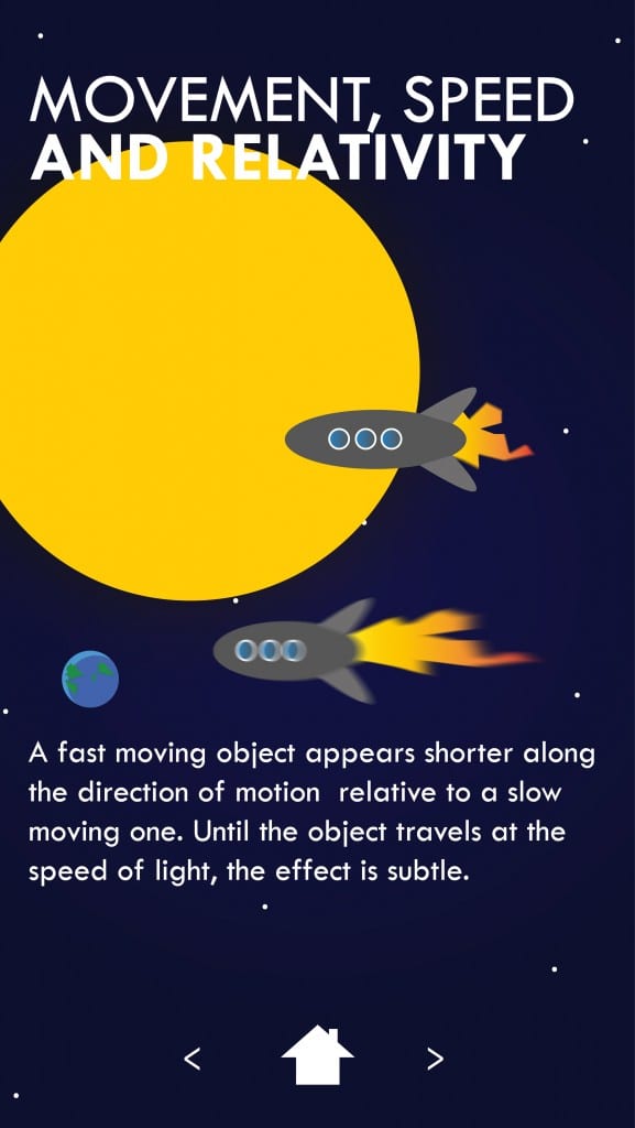
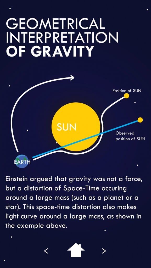
My target audience was people with a casual interest in space and the science behind relativity, with a main target age of teenagers. I feel the target audience aim has been achieved, as the design is aesthetically interesting and yet informative. It also does not present too much at once, and breaking up the screens into the different layouts should make it feel easier to take in the information than simply looking at a large body of text and a diagram. The use of the colour palette works well on the app, and the legibility I was aiming for also worked out well. Click the screenshots below to enlarge.
Leave a comment