Early logo ideas
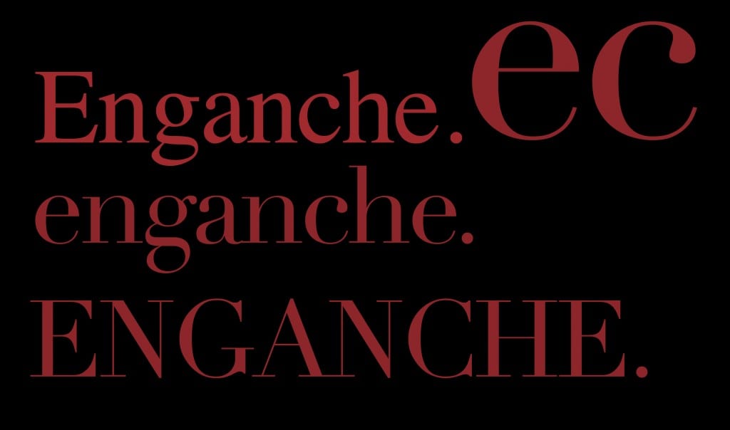
I wanted to keep Enganche as a logotype. I felt the typeface I chose (Didot) was distinctive enough with the specific colour, kerning and capitalised letters. The typeface is classy, and hints at both class, and mystery (some of the thin parts of the typeface appear to disappear at some distances!).
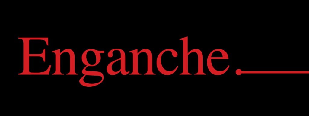
 Enganche logo in ‘Enganche red’ which would probably be a special trademarked red.
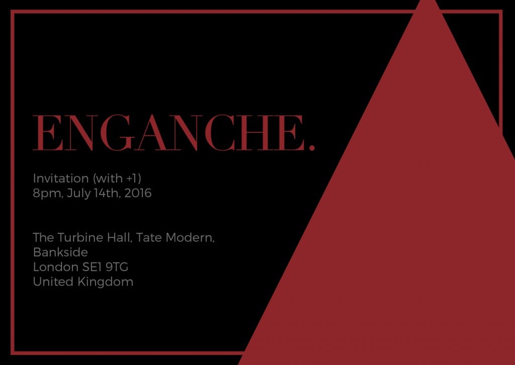
With the logotype, I began to assemble a quick design of an invite to see how the logo would work with other colours and design elements. The logotype, looked good, but instead of an icon, I decided to have a triangle as a design element that would be associated with the logo – wherever the logotype appears, the triangle accompanies it, in a number of different forms, styles and guises. The triangle is symbolic of culture of a venture capital firm. It represents the three sided structure of their business model (investors, venture capitalists and startup companies). It also represents power, control and wealth.
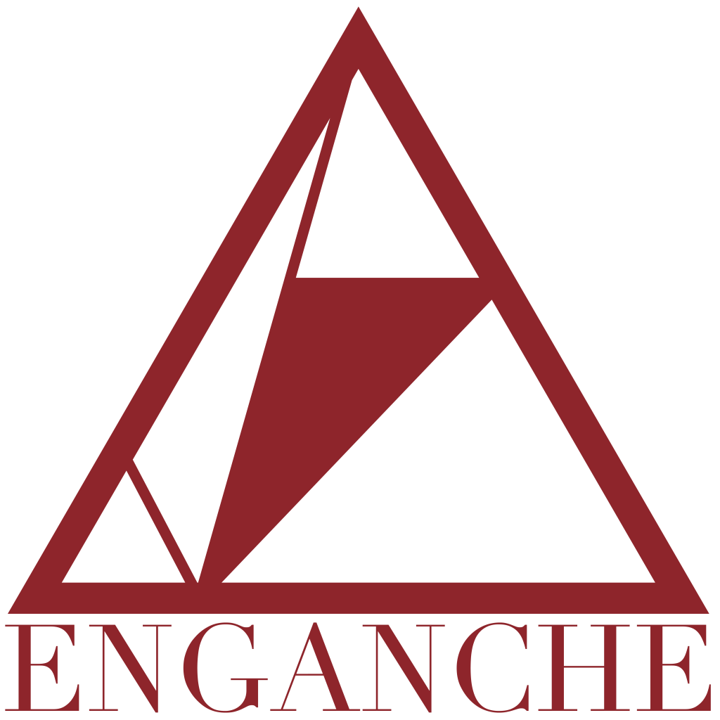
As Enganche would be sponsoring a number of art and architecture awards, making the triangle specific to Enganche meant that I could play around with a number of different artistic styles. Triangles appear frequently in modern art, and a few of my ideas were influenced directly by the Louvre’s glass pyramid.
I then developed the logo further, and worked through a few mockups to see how it might look.


Leave a comment