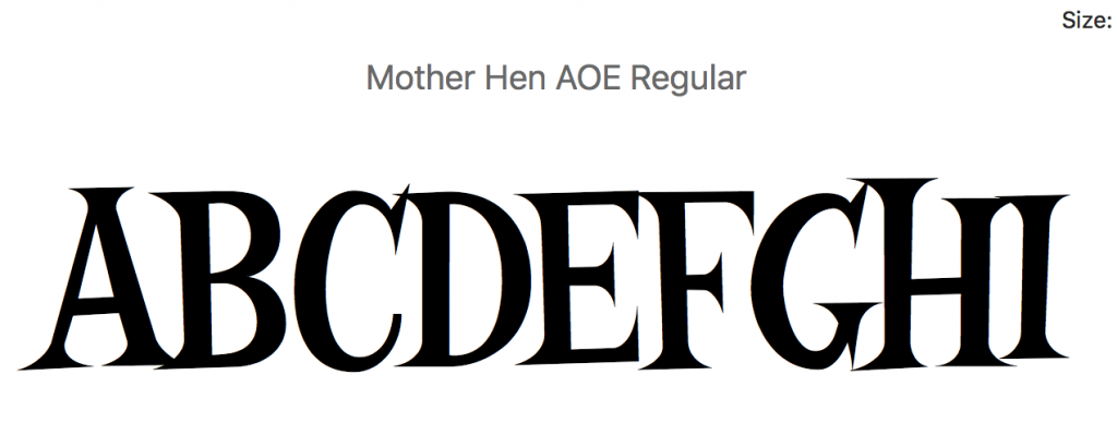
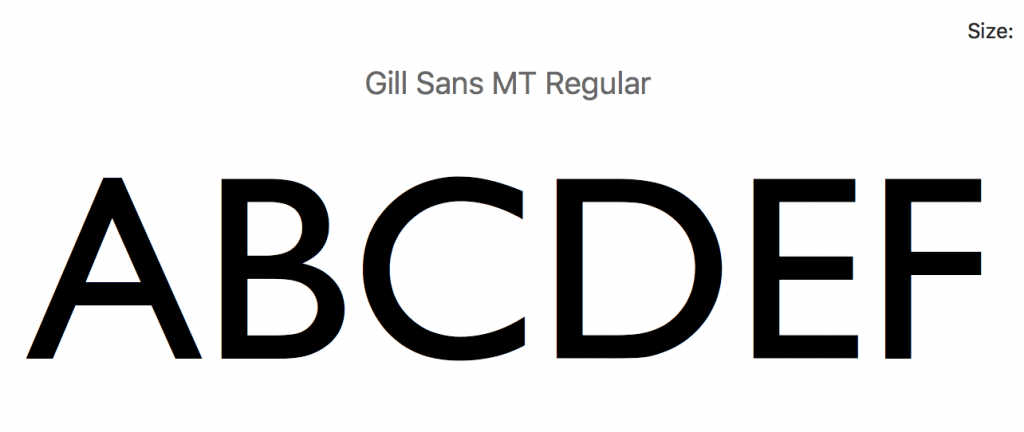
My goal was to create a font both legible at long distances but distinctive, and somewhat quirky. Combining elements of both Serif and Sans Serif typographic styles.
I began to compile some fonts I liked elements of. I like Mother Hen in the way it looks both classical, but has quirky features and distinguished shapes, at the same time, it is hugely distinctive, which is why it is used by places such as Alton Towers. At the same time, I like the geometric shapes used in fonts such as Gill Sans or Johnston.
I also began to look


Leave a comment