The branding of Enganche has been a difficult process. The brief stated that the company was mysterious, and yet they wanted to increase their membership and exposure in the art and architecture field. Initial research showed me that the designs were rather uninspiring and not that memorable. They generally had a fairly distinctive font (not custom designed) and a single or two colour work mark. There were little to no logos or icons associated with their logos. The most prominent feature of Balderton Capital was a full stop. One aspect I did think worked well, was their use of a defining colour within the logo. Something that tied up their visual presentation.
Branding Guide (PDF)
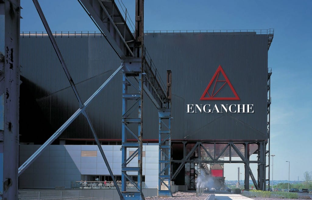
COLOUR
My starting point was the colour. From looking at the other venture capital firms, whose branding has been well thought out but a little dull, I had decided that Enganche should be something striking. For this reason, I decided to use Red. The colour has a number of connotations, but with Enganche, I will be focusing on ‘excitement, danger, courage and aggression. Surveys suggest that Red is “frequently associated with visibility, proximity, and extroverts. It is also the color most associated with dynamism and activity” [1] Somewhat inspired by the professional ‘Black ‘n Red’ notebooks, I combined this with a gray and a ‘not black’ – a slightly off black which can be used as part of the triangle and make it slightly visible on a complete back background!

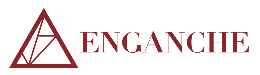
LOGO
The final logo is a mixture of a number of my ideas. Initially, I was going to use a word mark, with a triangle as an shape that was associated with it, but not as a logo. As Enganche wanted to be seen as a ‘different’ kind of venture capital firm, I decided a logo should also be used. Basing it on Enganche’s associations with the arts and architecture, the logo is somewhat inspired by the Louvre glass pyramid in Paris. It provides a distinctive logo to associate with the company. The logo also communicates a number of other ideals that would be suitable to associate with Enganche.
-Power (the triangle represents power, used by the Egyptians
-Strength (the triangle shape is strong, often used in construction applications)
-Wealth
-Danger
-Modern
-Business Dynamics
A number of different versions of the logo have been made for different applications. The logo works well in both large and small versions. For internal communications, the company can use the logo with the word venture capital underneath. For external communications, letters to new prospective clients, the logo with the standard word mark or just the logo should be used. This helps to keep the mystery surrounding the organisation.


BROCHURE
Click for the Enganche Brochure (PDF)

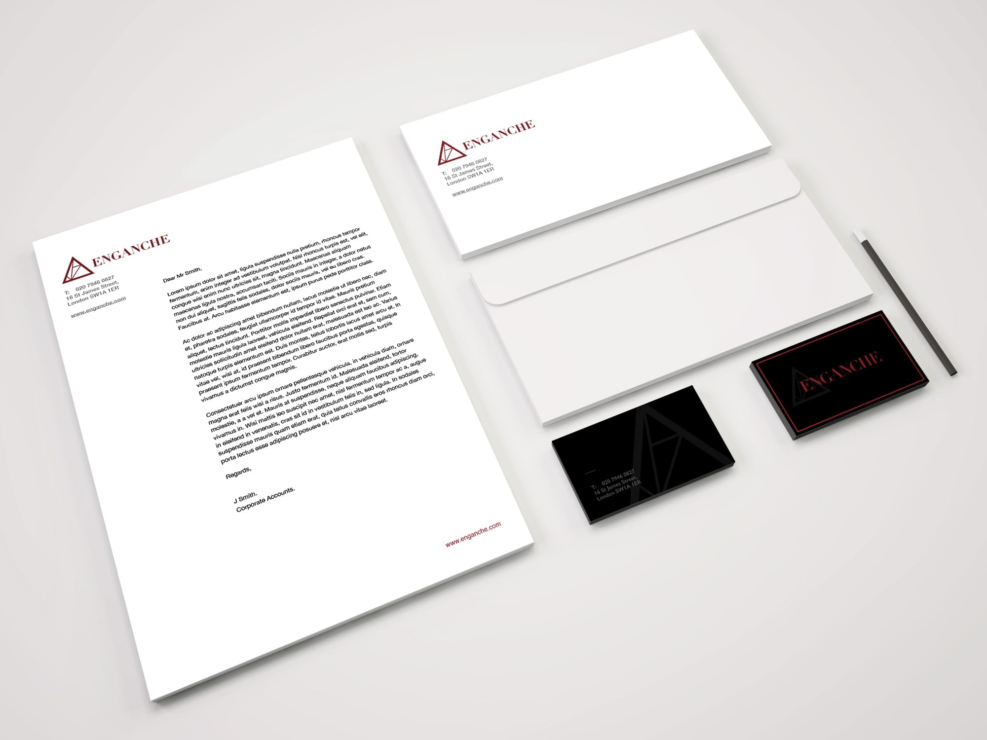
STATIONARY
Enganche’s stationary is simple and elegant. The focus is on the content, and yet the design fits Enganche’s style. The letterhead and envelope provide the essential contact detail.


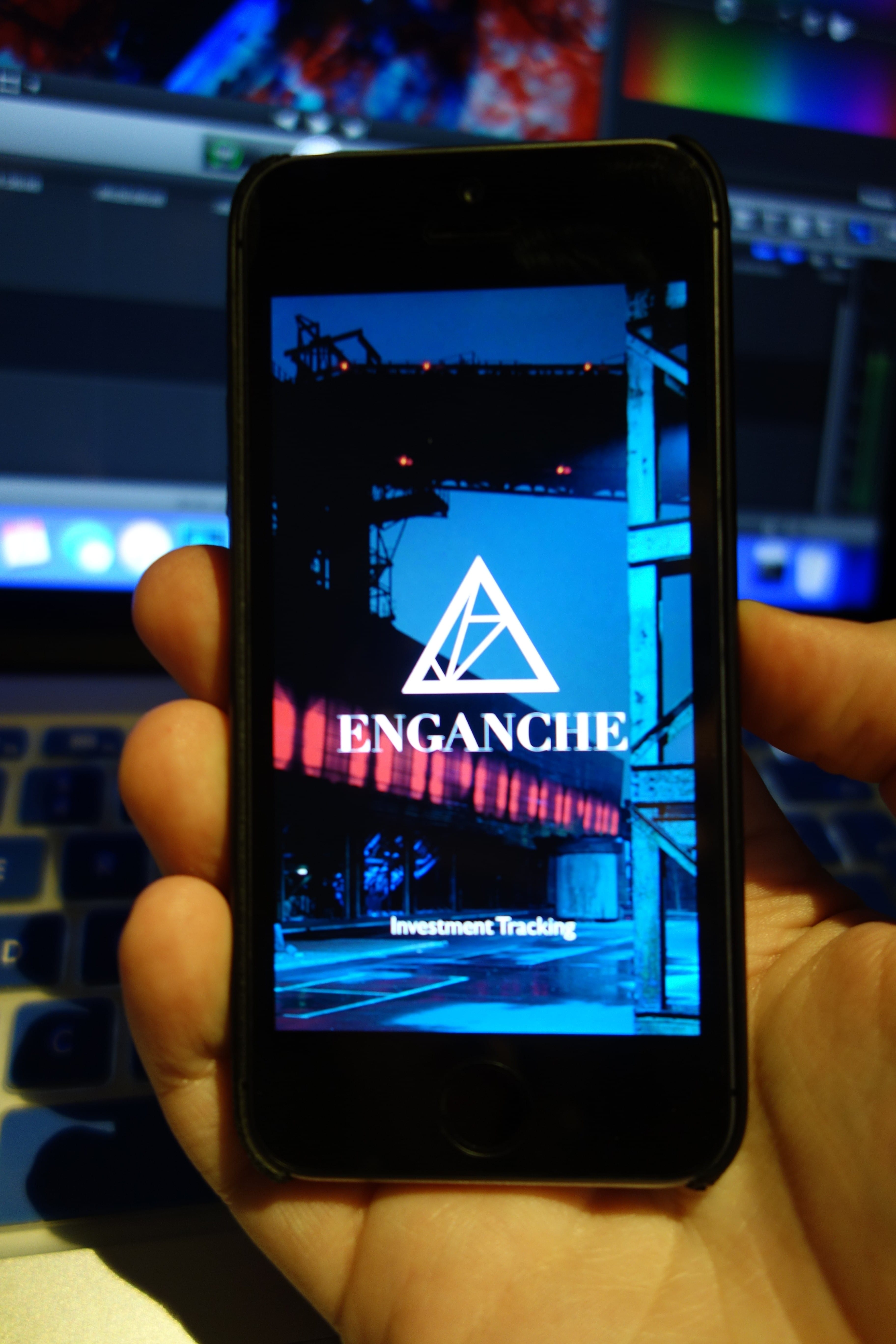
APPLICATION
I also designed a mockup of an Enganche app, for clients to track their investments, and to get in touch with their account manager.


WEBSITE
The website would be simple. Enganche prides itself on its personal touch, so the site would likely be a simple image slideshow with the information to contact them directly.

AWARDS BRANDING
I decided to reuse the original logo design as the Awards branding, as I felt that the simpler shape made it easier to for it to be put to use on a larger variety of media.


![]()
ON REFLECTION…
The Enganche project is probably the project I am most happy with the (both outcome and the process) throughout the year. The unusual company brief gave me a room to experiment with new ideas, yet still work towards a ‘professional’ look for an organisation. Researching press launches and branding that have been intentionally shrouded in secrecy was interesting. The project research took me from looking into venture capital firms branding, the Louvre gallery and to Alton towers’s 1997 launch of Oblivion – quite a mix. Yet I feel that it has actually worked!
I that the logo design and supporting graphics/elements work well together. They have a modern look, and a clear link to the arts and architecture side of the business. Early logotypes I had done were rather basic and did not do much in the way of making the brand recognisable. I debated it for a while, but I think the logo (triangle icon) is strong enough to be on its own and ‘mysterious’, but also to be with the word mark.
Overall, I think the branded stationary, websites and apps show that the logo works on a number of different media, in different context, and most importantly, different sizes! If I had more time, I would probably have developed the branding guidelines in more detail, as I feel that although the logo is usable in a number of ways, this should always be set down strictly, before someone in the Enganche HR department puts it on a gradient background and the simplicity of the design is lost.
Oh, and now I know what a venture capital firm is.
[1] Eva Heller (2000), Psychologie de la couleur -effets et symboliques. (pg. 48 and 58).
Leave a comment