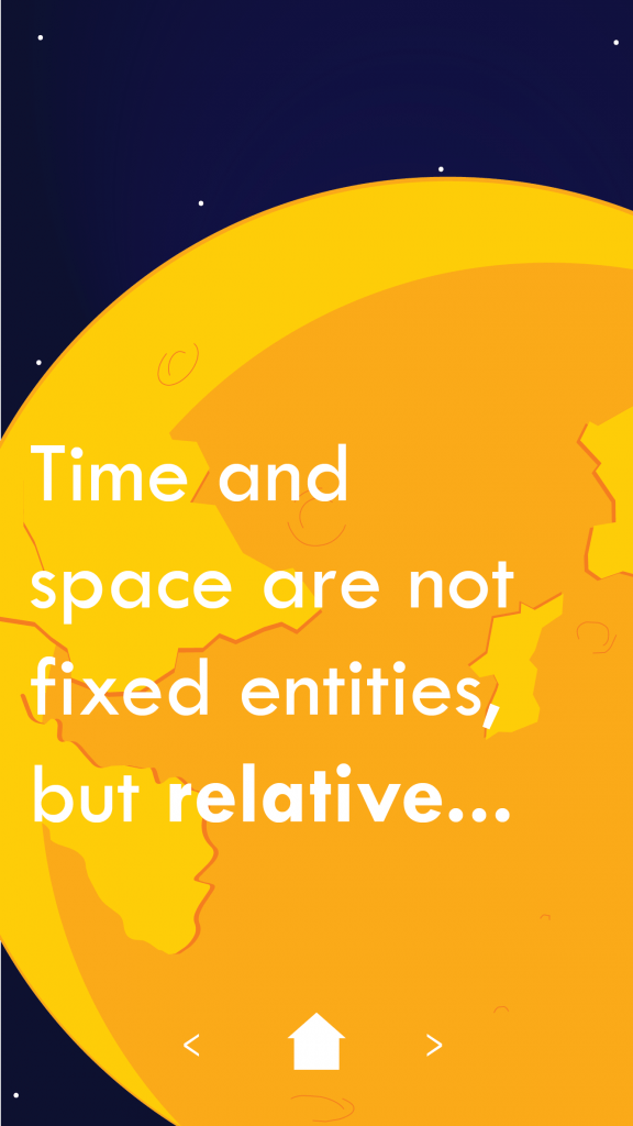
By this stage, I was fairly settle with the basic design strategy, but it was simply a case of refining it and making it generally look better! Initially, I planned to use a single colour background, but found that a very slight gradient worked well, and helped with the dynamic and ‘3D’ parallax effect I was aiming for.
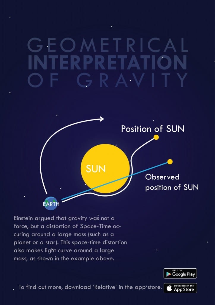
Using the parallax style and the variety of framing on each ‘page’ it allowed me to let the information flow naturally, going from large block quotations and facts, to infographics and a more detailed explanation. I also began to explore tweaks on the style for the poster. Below is a very early draft. For the poster, I wanted to place more emphasis on the infographic, so I added different text effects to blend the text with the background, and draw the eye to the centre (also done with the subtle background gradient).
The poster has given me more space to work with an experiment with. As the intention is for the poster to be much larger, I was able to change the title font from bright white to a soft overlay.


Leave a comment