For my first attempt, I decided to go for something looking a little more organic. I shredded some dark blue card and assembled it into individual letters. The output looked unique- the imperfection in the shredder output gave the letters a distinct rough look. During the construction of the letters, I slightly cut some pieces shorter, and set them out so they would not fit perfectly (most notably on the ‘C’). The imperfection from the shredder gave the paper a curl at the end of each piece, meaning that some of the ends of the pieces are rounded, some are not.
For the most part, this technique worked well, although there were some problems. It was difficult to produce decent looking and distinctive lower case letters. Another problem (certainly with this test version) was that some letters simply did not work well in this style, and would need some tweaking. For this reason, I omitted the originally planned ‘S’, although a more complex ‘S’ shape could be produced with additional paper strands.

(Original Scan from assembled letters)
(Digitised copy via Adobe Capture App)
I also played with the variables in the adobe capture app. This gave the type a softened look which I quite liked. The rough look I was going for was still effective yet was more ‘inky’ and felt a little more natural.
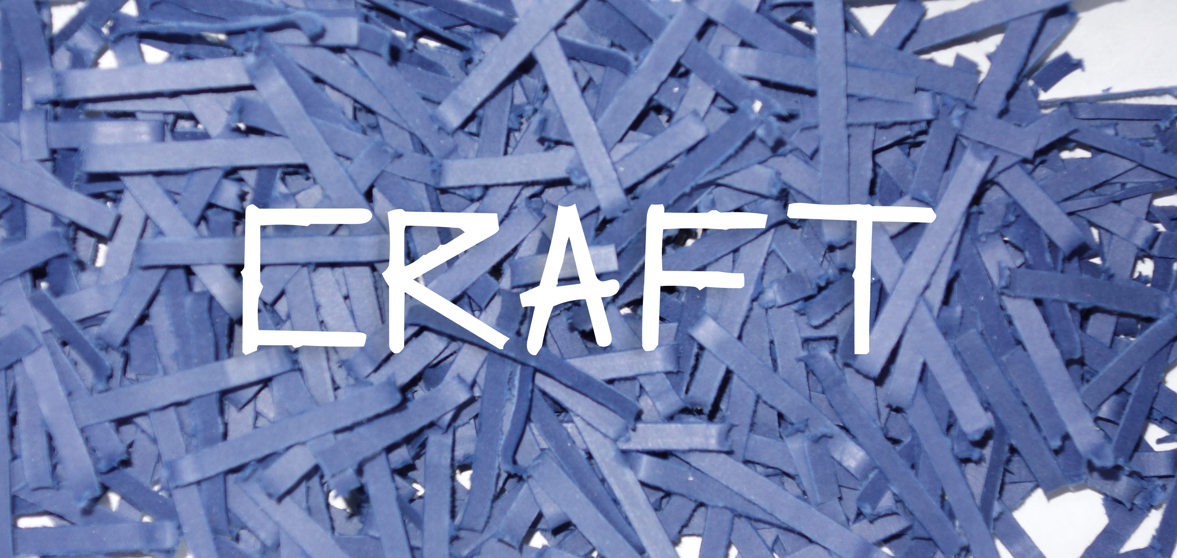 (Example of use within context, against backdrop of original material!)
Leave a comment