Based on the research I had done, and the contextual information on the company, I began to construct a basic idea of the principles that Enganche want to be attached to the brand. I started to write down some key words in my notebook, and found myself admiring the colour scheme used in the book. Red ‘n Black books are timeless in their design, and are set aside from normal notebooks, proclaiming themselves as “The natural choice of the true professional” and are considered to be robust, strong and dependable. I realised that Enganche’s values are similar, wanting to be set aside from the rest, yet be timeless and dependable.
Colour
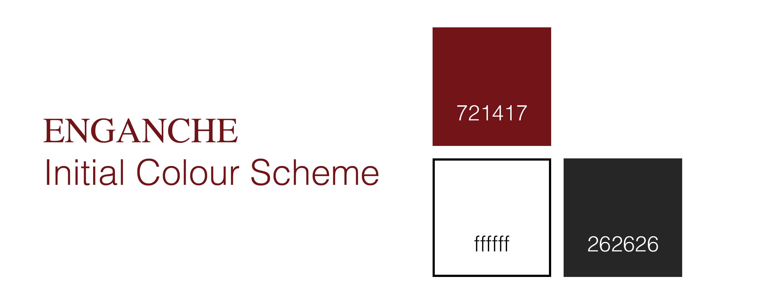
From looking at the other venture capital firms, whose branding has been well thought out but a little dull, I had decided that Enganche should be something striking. For this reason, I decided to use Red. The colour has a number of connotations, but with Enganche, I will be focusing on ‘excitement, danger, courage and aggression. Surveys suggest that Red is “frequently associated with visibility, proximity, and extroverts. It is also the color most associated with dynamism and activity” [1]
From there, I started looking at different reds, from bright red, to maroon and burgundy in colour. The latter looked more subtle and dark, and also didn’t look too brash.

My design ideas, planning, random scribbles and procrastination in my notebook.


[1] Eva Heller (2000), Psychologie de la couleur -effets et symboliques. (pg. 48 and 58).