Initially, I wanted my infographics to have a modern comic book style, using a narrative speech bubble and narrative in the top corner. In developing this initial design idea, I began to work out the atmosphere I wanted to for the mobile application. I wanted it to be fluid and smooth, and to utilise a parallax setup, whereby the foreground and the background move independently. Building on the ‘comic book’ idea, I decided it would also be visually stimulating to be constantly changing the framing throughout each screen, as to make it interesting. Keeping with the idea of simplicity, I also decided to use a very simple navigation system, using only a forward and a backward button. As you cycle through each screen/page, the camera slides along, with the framing changing depending on the size of the object, and the distance from the camera.


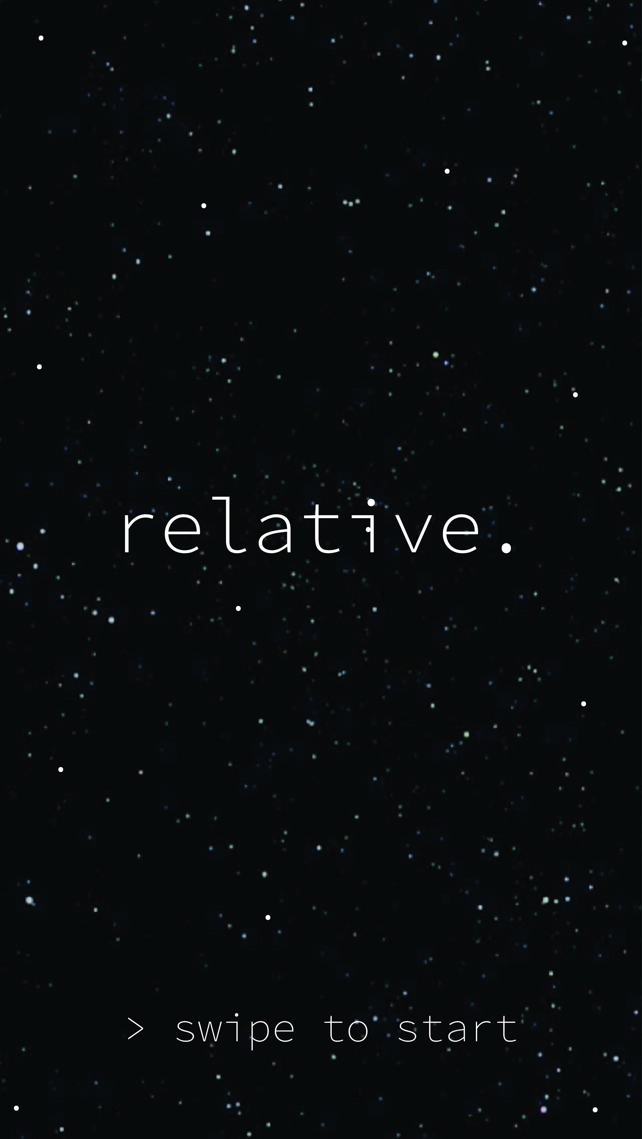

While I was happy with the minimalist style I had chosen, I felt that the text was too thin for smaller bodies of text, and would not be as legible on a small mobile display. I also felt the grey colour did not suit the topic as much, especially for my target audience. My goal was to create a beautiful but casual way of learning interesting facts about relativity, and the grey did not help.
To change the text, I began taking inspiration from examples of typography that are designed to be both stylish and distinctive but remain legible at most distances and sizes. I drew inspiration from the East Midlands trains branding, which uses Twentieth Century (not Futura!) as their main general purpose font. I also noted their use of a very strict colour scheme, using mainly blue hues and clever uses of the Red colour taken from their logo. Using such a plain yet iconic design style, the focus is clearly on the content and the information provided.


With that firmly in mind, I began to tweak the design of the apps.

Initially, I had planned to focus solely on the effects of gravity, and highlighting the word on every appearance by making the ‘G’ red, and using it as the application logo. This soon turned out to be impractical on the large bodies of text, and on the new navy/dark blue background. I had also noticed that the small stars had begun to interfere with the white text, now that they had been released from the boxes behind them (as seen in the previous iteration). I therefore had to move each star that was in the way of the text to stop it from interfering with the legibility I need on such a relatively small screen. For was of use, I also added a home button (to be refined!)
Leave a comment