In addition to researching the designs and conventions of venture capitalist firms. I have also looked at other designs that I feel will suite the style and tone I am looking for. As Enganche is a decidedly different venture capitalist firm, inspiration from different places will be useful in building the brand. The design needs to be clean, classy and slick. I was interested in the Redtree PR corporate identity, which also comes across as clean and stylish, The light use of accent colour is particularly something I want to adopt with my own designs, and the company uses a small colour palette which works effectively.
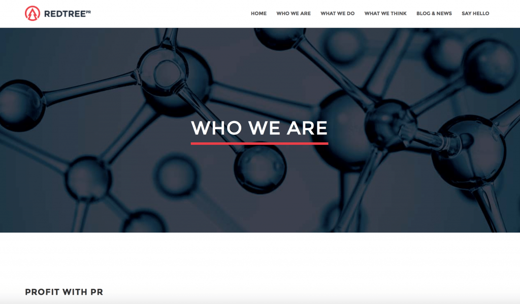
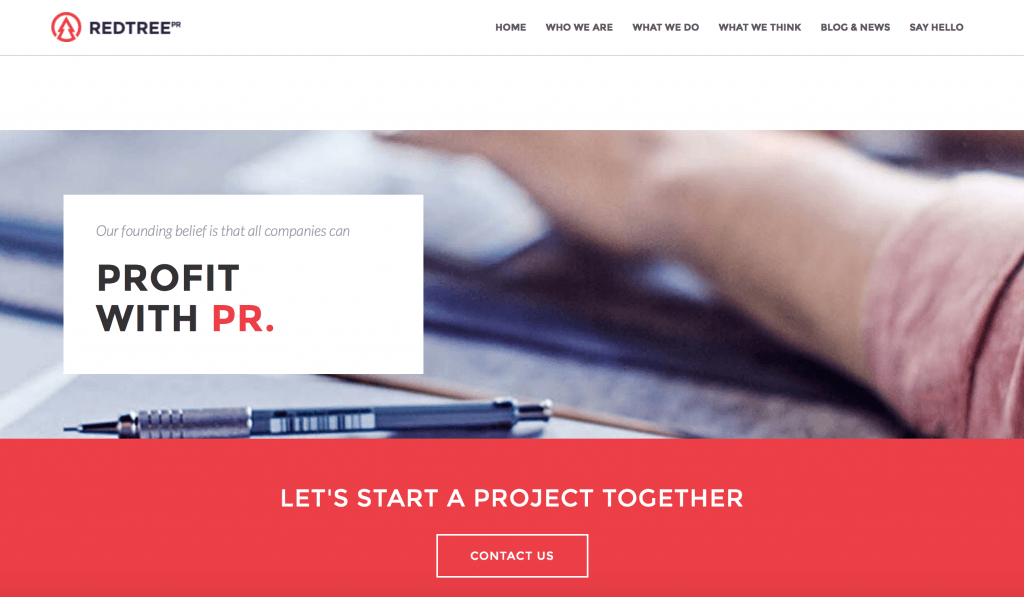
 (Redtree PR website)

Their business is clearly designed to attract similar people – they are a service based company, so their site has to clearly evoke the meaning behind the company and its values more than selling a product would. Red tree (like most PR companies) needs to be seen as modern and ‘with the times’ as PR is an ever changing world. For that reason, they use a lot of sans serif fonts and modern design principles. Although the website at times looks like some generic wordpress theme, the actual use of colours and the logotype works quite well, although I do get the impression sometimes that the logo belongs on a slightly upmarket sports clothing brand.
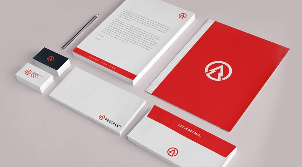
Red tree Pr’s logo is versatile and can be used and adapted in a number of ways, depending on the application (see stationary above). The set uses the organisations logotype and colour scheme in an eye catching way, an the company alternate between just using the icon, and using the full icon and logotype on something that could be potentially used by new clients (such as a compliments slip etc). The set looks sophisticated thanks to the simple colour scheme and large white space, although the red document wallet is very striking and something which I feel could be used in Enganche’s design or stationary.
I have also been inspired by the way in which Alton towers introduced ‘Oblivion’ in 1997. The marketing campaign was hugely successful- they used simply the logo (without a logotype) and marketing materials to shroud the attraction in mystery. This could work well for Enganche, by using the logo on its own in certain situations to give the company a mysterious feel and therefore continue the ‘exclusiveness’ of the company.

Leave a comment