I have now begun to craft my final idea, based on designs I have seen and formed in basic sketches. My plan is to create a mixture of serif and sans serif, using serif based traditional lines and proportions, with sans serif clean lines and designs. I would like the font to be legible from a long distance, suitable for signage etc, but at the same time, look distinct and quirky.
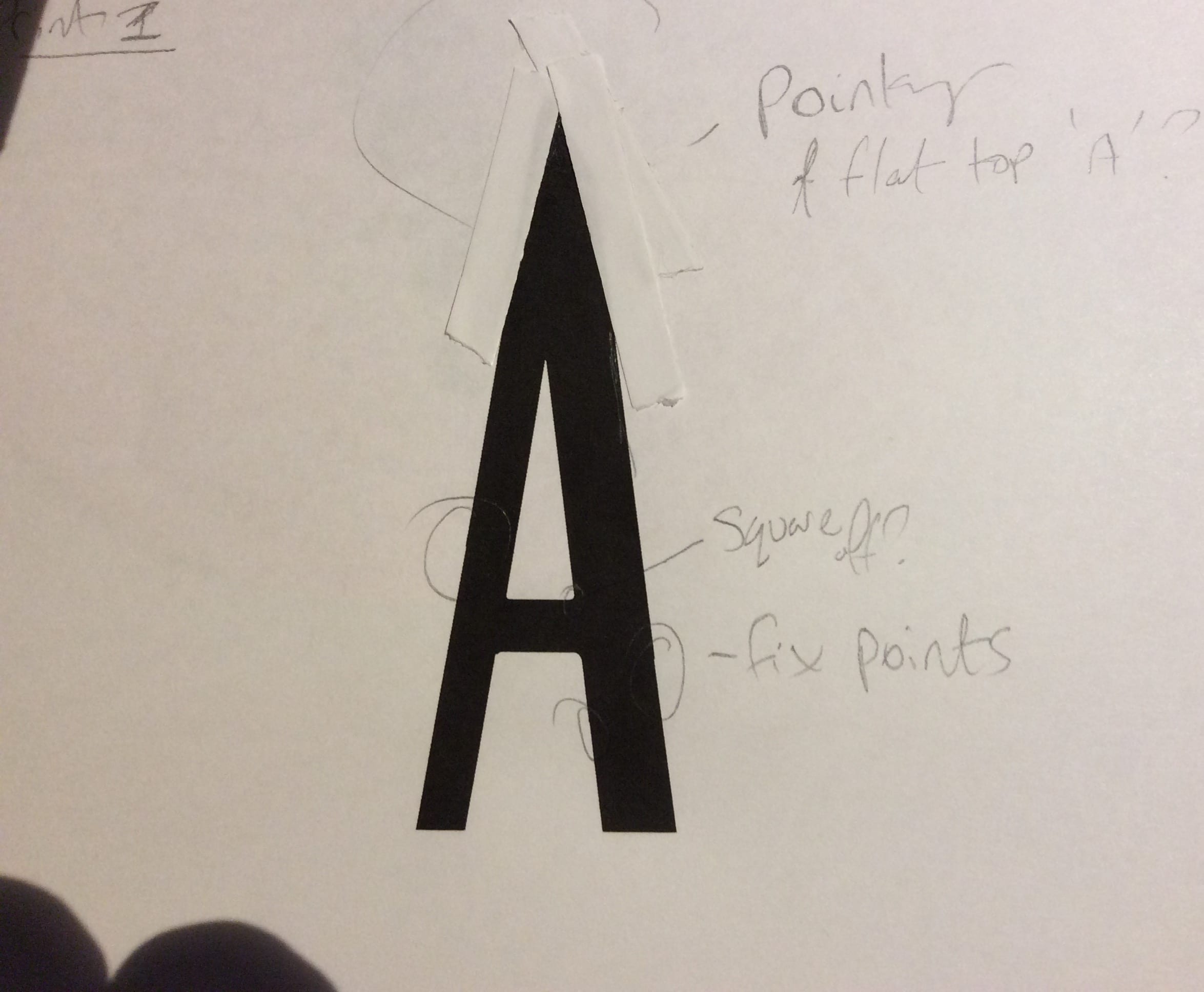
I started by designing a basic capital A in adobe illustrator, printing it out, and then drawing amendments or ideas onto paper, allowing me more creative freedom to experiment with ideas. During this period, I experimented with the edges of the lettering – whether I wanted a pointed top, or rounded edges etc.
 Eventually, I came up with this as my first letter design. It is as I had hoped it would be, with emphasis on the centre of the letter. From here I made final refinements to the basic design before moving to the next letter.
I have also experimented with a wider version of the font, with the corners less rounded, but I didn’t like the early trial versions so much.

Leave a comment