I have started to look at Corporate design and identity packages. Branding is hugely important to the identity of a company – logotypes and branding are key to recognising a brand and brand values within an instant. First impressions mean everything.
Consistency amongst branding is also important. If branding guidelines are not given, the strong brand devised by a design company could be tarnished. A particular interest of mine is broadcast design. Good design and strong identities within broadcast have become increasingly important in the age of hundreds of channels, online content and multinational media companies. It also has to work within a number of formats, from stationary, to on screen, so social media and web, to corporate literature. I have begun to research style guides from major brands and organisations in an effort to see how they are constructed and what the most important parts are.
ITV 1 Presentation Refresh (2001)


In 1998, ITV refreshed their on screen branding as part of a huge shakeup to consolidate identities (previously each region had their own) and to make their brand stronger. In the end, SVC created up to 3500 sequences alone, with the entire exercise costing £1m.
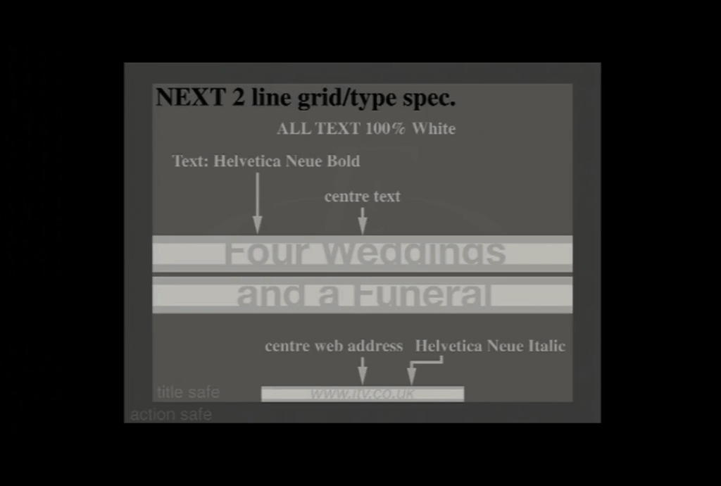
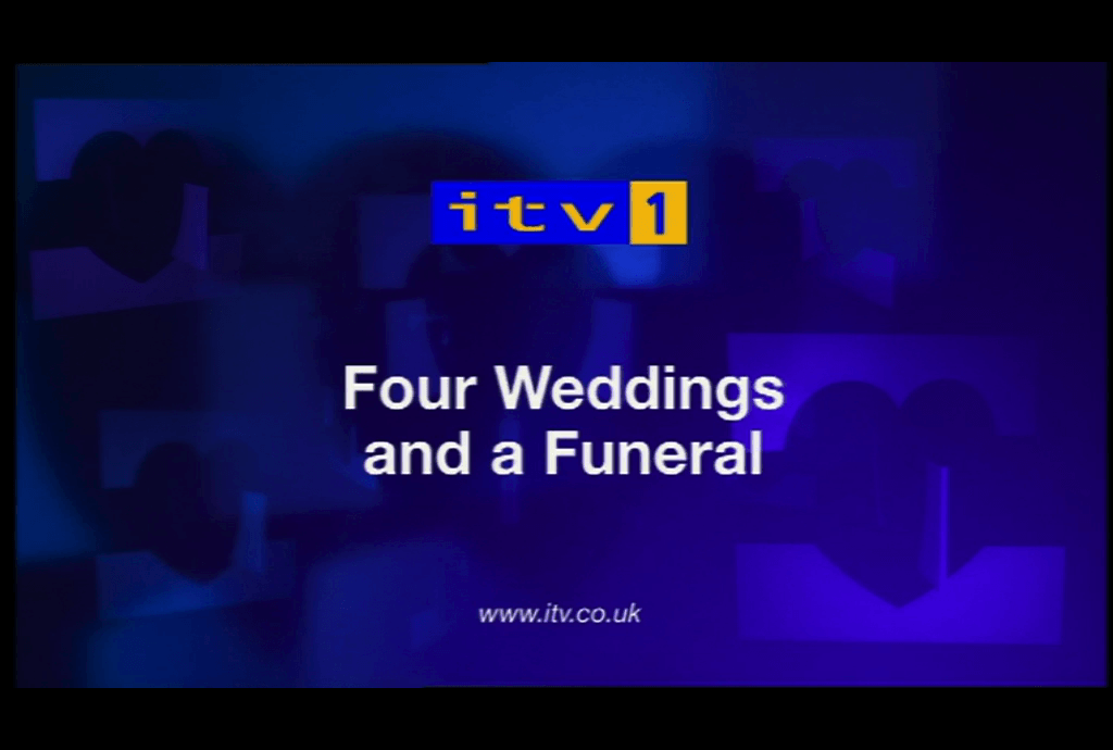
Rolling out consistent branding throughout the UK, the company supplied strict guidelines to broadcasters. Below is a screen capture of an example of the typography to be used.


This researched how important a unified look is, and how important branding guidelines in terms of typography are.