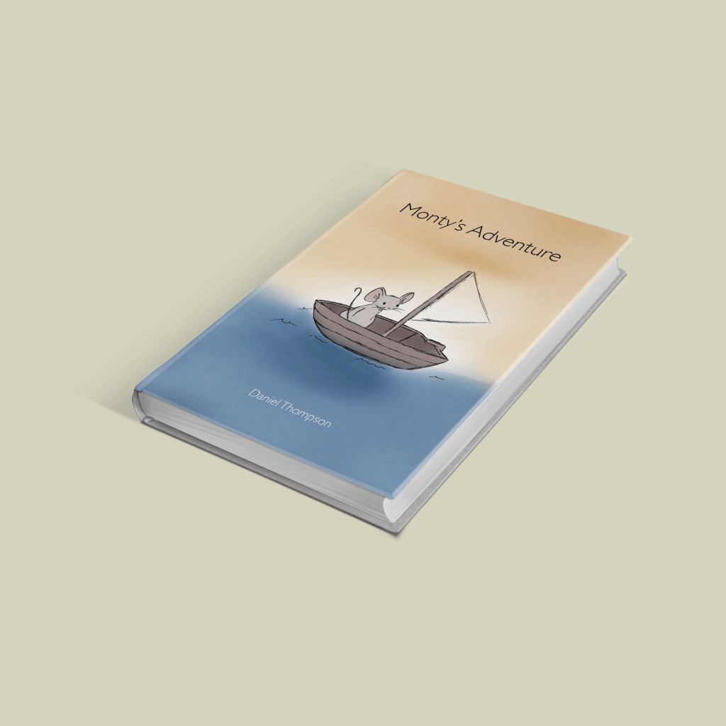
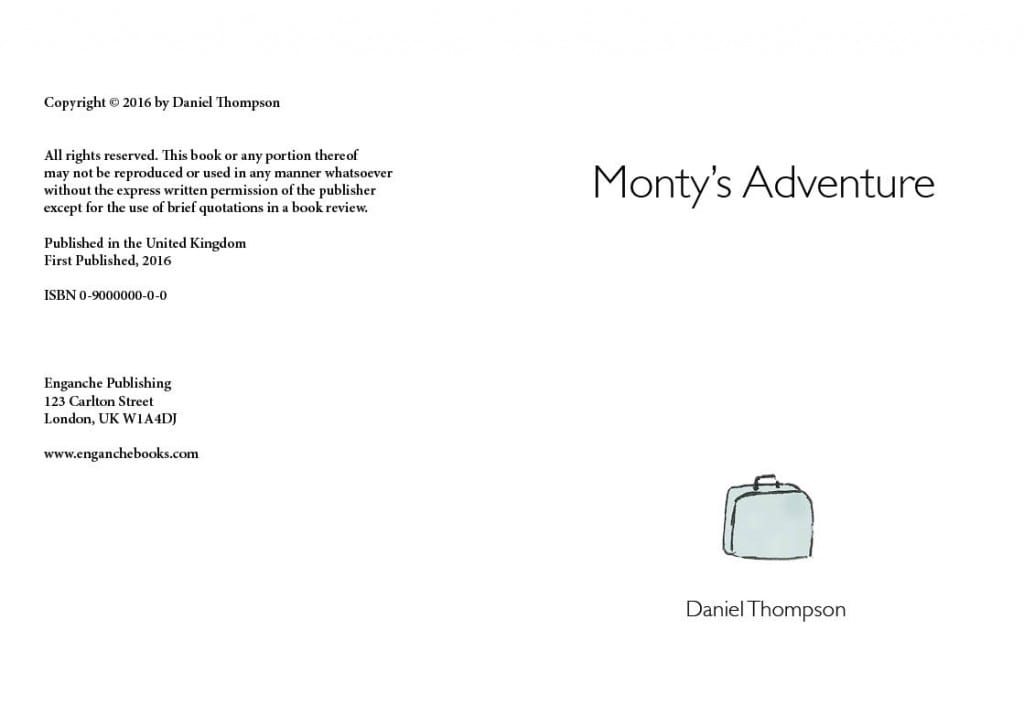
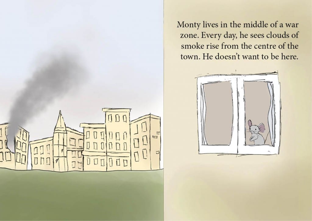
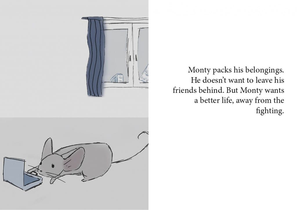
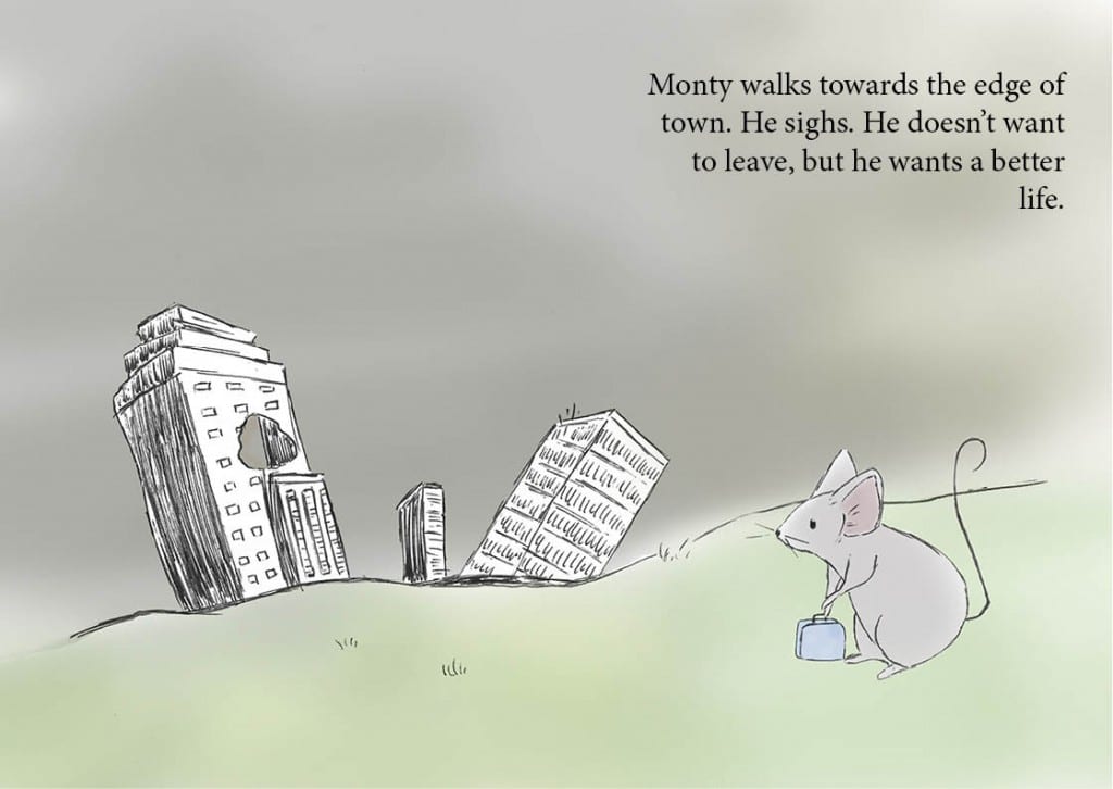
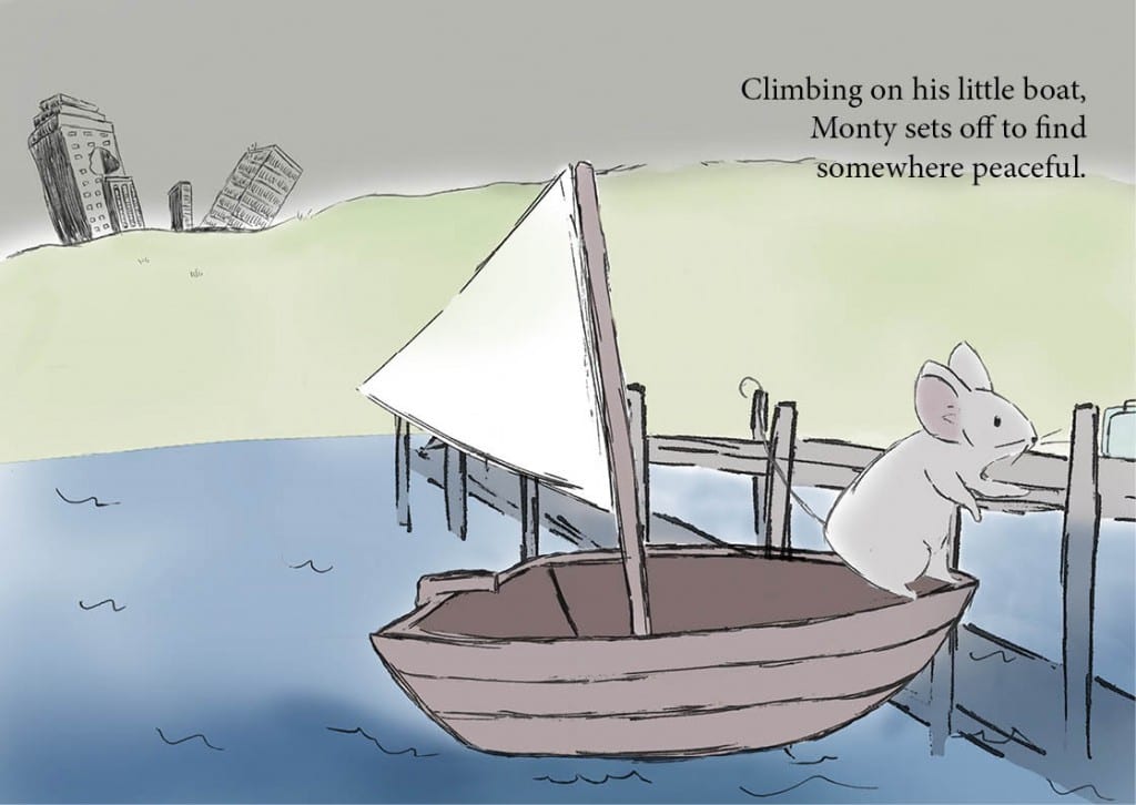
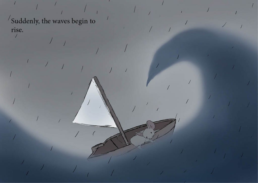
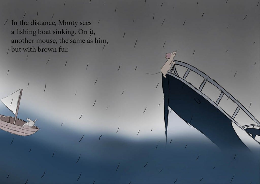
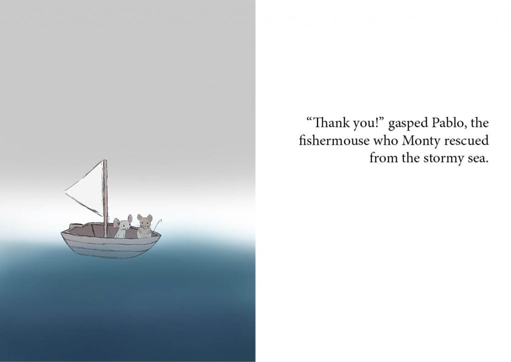
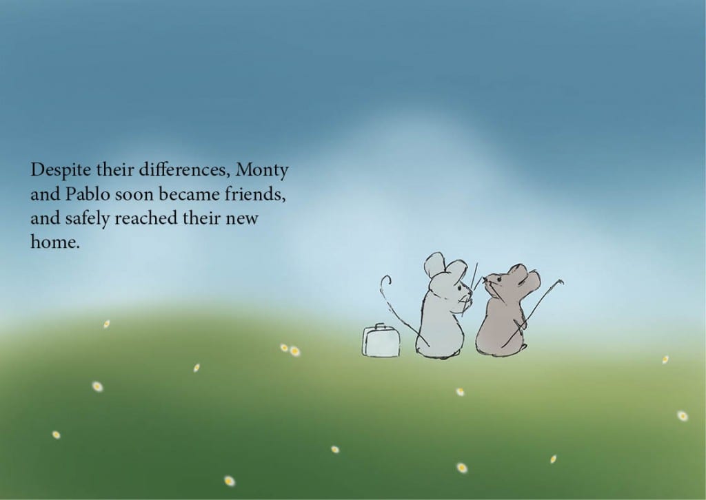
The book didn’t undergo as many drastic changes throughout the project as I imagined. It was mostly changes in direction of the backgrounds, layouts, and details. In the end, the book has followed a traditional children book style, and ‘hides’ its subject matter in an upbeat tone that could be understood by the intended audience.
One thing I did change a lot, was the typeface. I started with the cover having a very scripted looking font (Telefonica Script, an internal font used by telecoms company Telefonica), then later moved to Gill Sans Light when I began using backgrounds. It kept it clean and simple- the scripted font was vying for attention away from Monty!
The book is here! FINAL BOOK [PDF]
FINAL REFLECTIONS
This project has been difficult for me. I wouldnt say I’m the biggest reader of childrens books. Neither am I a writer or an illustrator. I feel that the book went as well as it could go. I am happy with the layout, and the majority of the artwork, but as always, more time could have been spent on it to refine it further. I think the style is consistent throughout and am happy with the way it was put together. The storyline could be improved, but as I said, writing short stories for children on issues isn’t my strong point, and this is a graphics module. I am extremely happy with the cover, and did play around with a few poster mockups! I feel i could have done some more research on childrens books which would likely have improved the outcome. Overall, I think I set out what I planned to achieve – a short story about immigration, differences and friendship, in an easy to understand and engaging story for 5-8 year olds.
