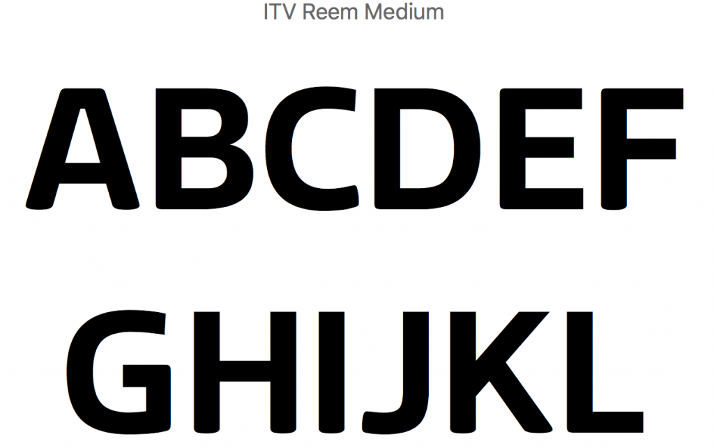
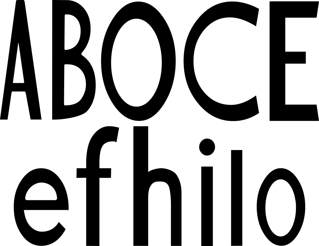
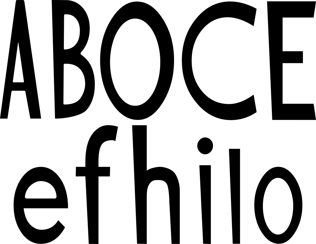
Drawing on what I had done with the rounded font, I wanted to make some of the edges more defined. I was inspired by ITV’s new internal font ‘Reem’ which combines straight corners, with rounded ones within the same character.
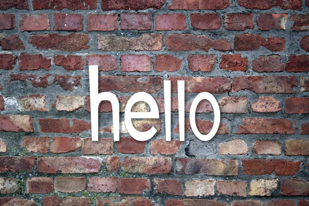
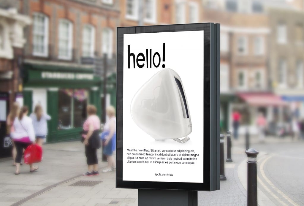
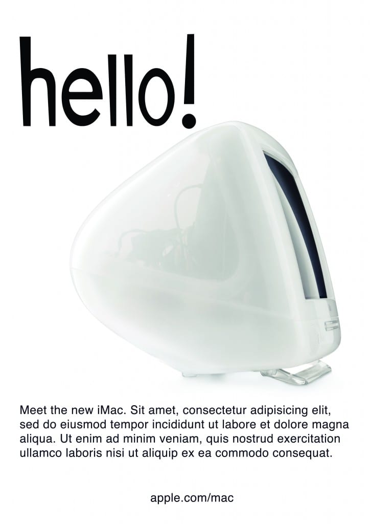
For my examples, I used the slanted version of the font, which look quirky and fun. I felt these worked well as a sign, or something designed to look ‘creative’ or a product for creative people. I prefer the slanted version of the font, as I feel it is more recognisable and the characters work better together with that same line. The typeface is ideal for signs and banners, as well as logotypes and titles, but would probably not be as suited for bodies of text, although I have not been able to test that out. I decided to do different letters as I was interested in those specific shapes, and felt that they would be the most interesting to do. I believe the font it legible, yet quirky and ‘friendly’ and I am happy with the way it turned out.
Leave a comment