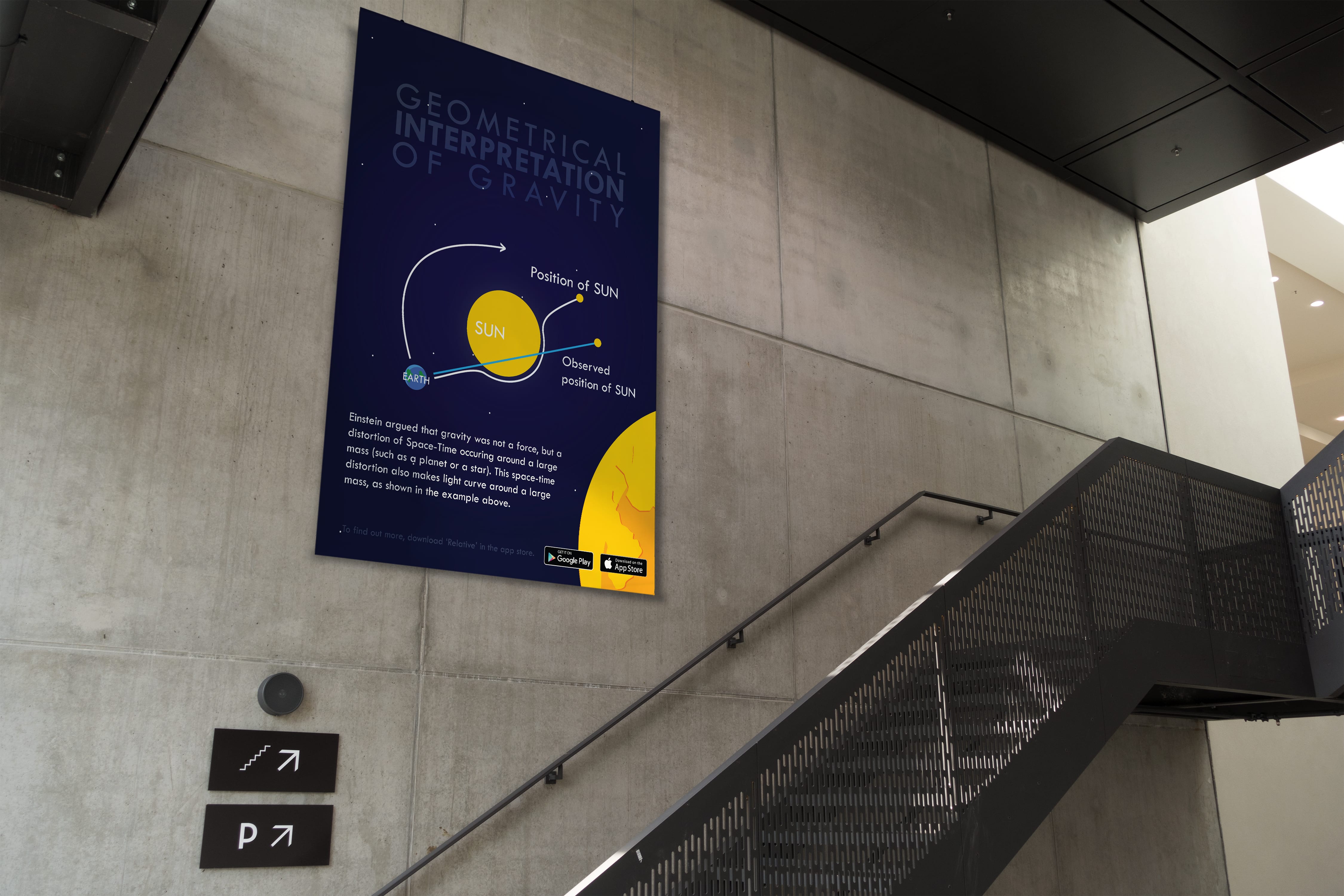
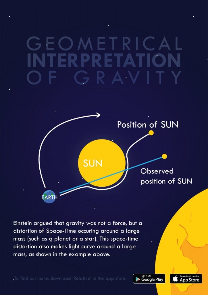
The poster is the piece I am happiest with. The size meant I was able to play around with different effects more and test ideas that would not have worked well on screen or using a small display. The design has been created to be simple, informative and intriguing, in an attempt to get people to use the website and App. The overlapping planet in the foreground is present to give the poster some depth. The design between the application and desktop is consistent, using the same colour schemes, fonts and shapes.


Leave a comment